
Update: This is an old archived post on this site and is only kept online for my own archival purposes. The content and images on this post this might be outdated, incomplete, or no longer relevant in today’s discourse. Please do not sue me if the Internet breaks because you read this and tried to do whatever was on here.
Pantone’s latest product, the PANTONE® Goe System is a completely new color inspiration / specification system introduced last September 2007. Our team received our own set just this January 2008 and we have been tinkering with it (and still learning) since.
Here is our first encounter and review of the good and not so good points of this new Pantone product.
What color system do you use, PMS, customized solution or swatches from the press’ ink vendor? It’s time you show us your true color.
The original request though was for us to purchase PANTONE MATCHING SYSTEM® (PMS) chips for coated, uncoated, matte and metallics which comes in one set. Something went wrong somewhere in the purchasing process (corporate stuff) and we ended up with Goe. We still want to purchase the PMS set as we still have a lot of uses for it and since it might take some time for everyone else to adapt to the new system. Meanwhile let’s get back to our review of the Goe.
In Style
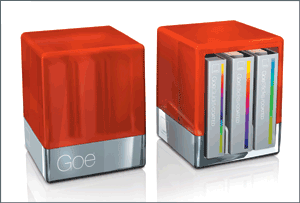
The PANTONE® GOE System (pronounced “GO”) is interestingly new (at least for us) and appears to have been designed for today’s rapidly changing, technology-driven creative industry. It comes with a beautiful (but damaged, more on that below…) stylish case which you’d love to place somewhere visible and be part of your creative space’s overall interior design (in short, a hip case!).
More Colors, New System
The existing industry standard, the PANTONE MATCHING SYSTEM® introduced almost 45 years ago, has 1,114 colors and is still the preferred choice by most professionals. It uses 14 base inks plus transparent white. It was developed during the time when graphic designers literally “cut-and-paste” design elements and letrasets into their artwork.
PANTONE® Goe System however comes with 2,058 chromatically organized color chips. It uses ten PANTONE Goe Mixing Bases, plus PANTONE Clear. These chips are based on the color wheel which makes it a very practical and attractive tool for graphic designers. No more skipping pages just to get through different types of oranges and browns.
I’m still a bit confused with the new numbering system but after a careful read you’d be able to figure out how it works. I also found a good read about it on veerle’s blog.
Collaboration and Tools
The set comes with myPANTONE palletes software bundled on a CD both for PC and MAC. They have also have an online community for palette sharing. The website, myPANTONE.com is similar with Adobe’s Kuler and Color Schemer.
I still prefer Kuler and find it more user-friendly or probably because I’m an Adobe freak.
Environment-Friendly
What impressed me was the fact Pantone’s releases are now re-usable, peel and place coated chips, which are already adhesive-backed and can be used multiple times. They have also included new PANTONE palette cards that the chips can be stuck upon when presenting to clients or for attaching to files.
The old chips were simply perforated and torn apart whenever needed resulting in chips ending up in some obscure corner near the light tables or in between the floor tiling if they somehow fell from the comp or job jacket.
Is the PANTONE MATCHING SYSTEM (PMS) being phased out?
Graphic designers and design studios would probably be the first ones to embrace the new system as we all find is easier to use since the colors are better organized from a designer’s point-of-view. But the rest of the industry might take a little longer to adapt. This is due to a multitude of factors involving pre-press, RIP software and other existing production concerns.
There are also thousands of Fortune 500 companies which use PMS colors for their corporate identity and style manuals. For these big players, updating to a new “color system” wouldn’t be cost efficient as they would have to re-print all their corporate identity manuals and other affected collaterals.
Perhaps a conversion system should be put in place to better integrate both PMS and GOE. This would enable the creative industry to smoothly transition into the GOE system without leaving out those who are using PMS in their color workflows.
Damaged Goods
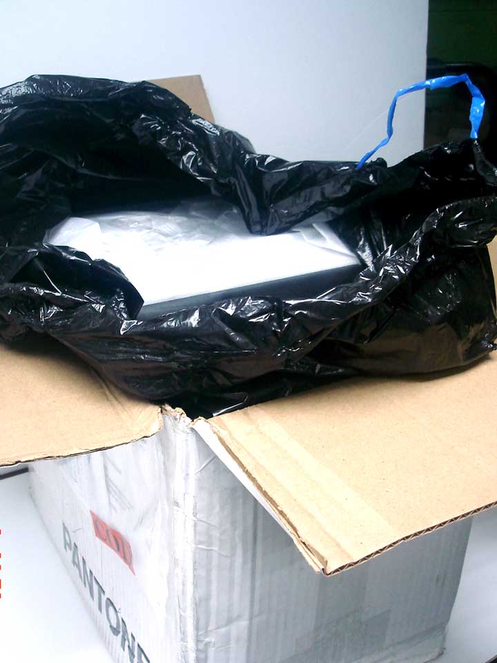
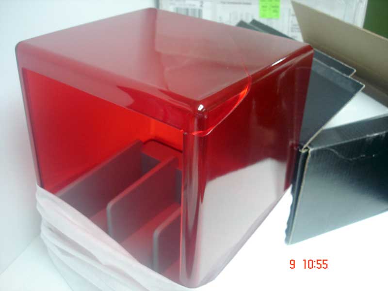
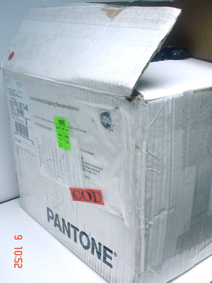
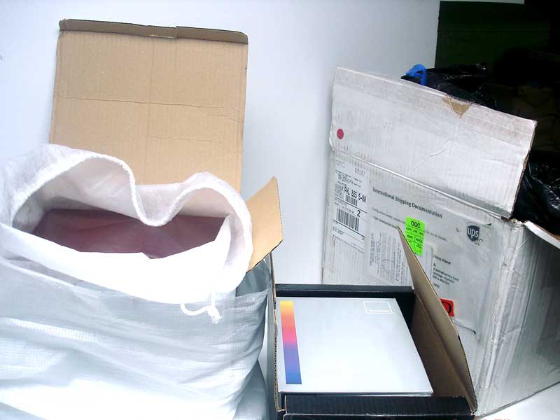
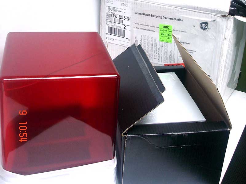
Unfortunately the package we got came in damaged with a huge dent on its box. As we had suspected, the GoeCube’s topside was cracked probably from shipping.
The fault lies in the packaging. The item was shipped on it’s retail box and was not given an outer box with the proper cushioning. We are still hoping that the thing gets replaced either by UPS or by Pantone.
To sum it up, PANTONE® Goe System looks very promising, it might or might not, end up as “the standard” for color specification eventually phasing out the PMS. When such a time will become a reality is still not certain. There are still some problems which need to be sorted out by Pantone and also adjustments will have to be made by printers and pre-press people on their present workflow. For design studios, the new tool would come in handy on a lot of projects ranging from print to web and multimedia.
Disclaimer: This is obviously not a paid post.
For more information about Pantone, Inc. and PANTONE® Products, visit www.pantone.com.